The can everyone remembers
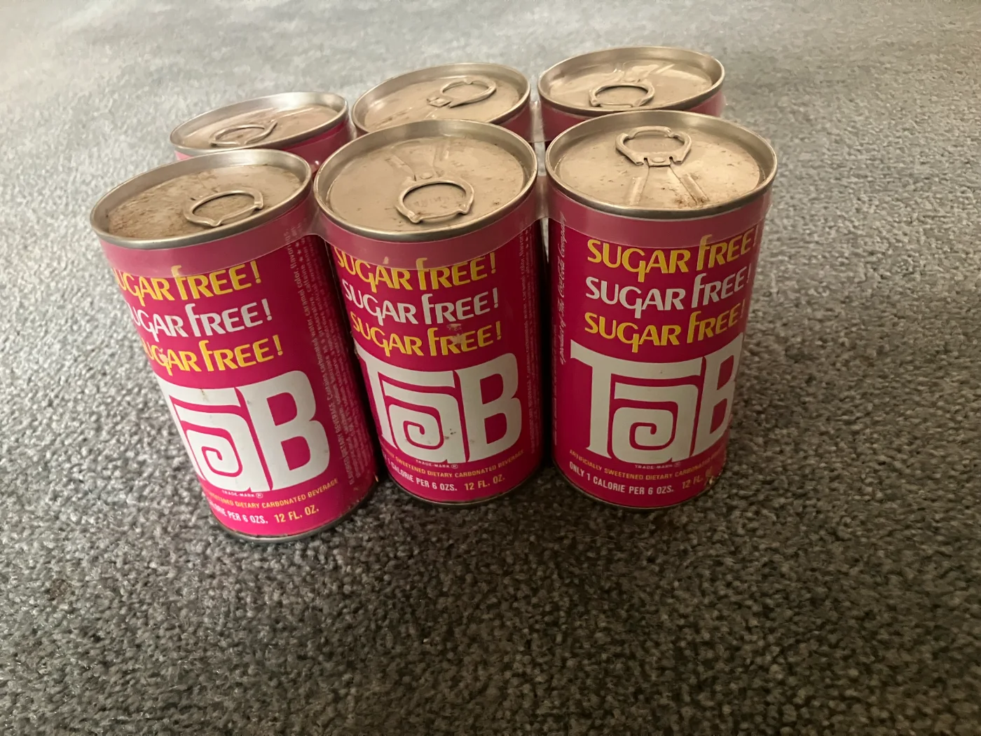
Ask a TaB drinker to close their eyes and picture the can, and they won't describe a logo. They'll describe a color, a flash of electric pink that didn't just sit on a shelf. It announced itself, humming under grocery store lights, leaning forward in a lineup of reds, greens, and browns. It caught your eye before anything else could.
It's the kind of pink that lingered. Decades later, it still shows up on T-shirts, in basements turned into TaB shrines, in kitchen pantries where the cans are stacked like tiny effervescent trophies waiting for their turn in the refrigerator. It never tried to look refreshing or sporty or citrusy. It looked like something you were supposed to love, a small, fizzy rebellion wrapped in aluminum.
Most people don't know the pink wasn't TaB's first look, and almost nobody knows the name of the man who made it so. We tracked him down: packaging designer Knut (kuh-NOOT) Simonson. What we found was the quiet truth behind an icon. It was a chemistry problem, a deadline, and one designer's plain, practical answer to both, an answer that ended up outliving the product itself.
Before pink: TaB's original look
When TaB launched in 1963, it didn't look anything like the can fans carry in their memories, and it didn't stay still for long, either. Over its first several years the can went through more than one look, mostly handled by the Chicago-based Dickens Design Group, a small firm with a surprisingly heavyweight client list that included Coca-Cola, General Mills, S.C. Johnson, and Budweiser.
The firm worked out of a building Sid Dickens, the company's owner, owned on the edge of Chicago's Loop, directly across from the American Medical Association's headquarters. The ground floor housed the design studio; Sid himself lived upstairs, in a penthouse apartment where he hosted the staff's holiday party every year.
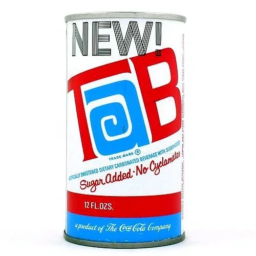
By the time cyclamate was banned in 1969, TaB was shipping in a white can striped in pink and blue, stamped "NEW!" and making its own urgent point: the cyclamates were gone, replaced for a stretch with real sugar. That was the can sitting on shelves when TaB landed on Knut's desk.
Enter Knut Simonson
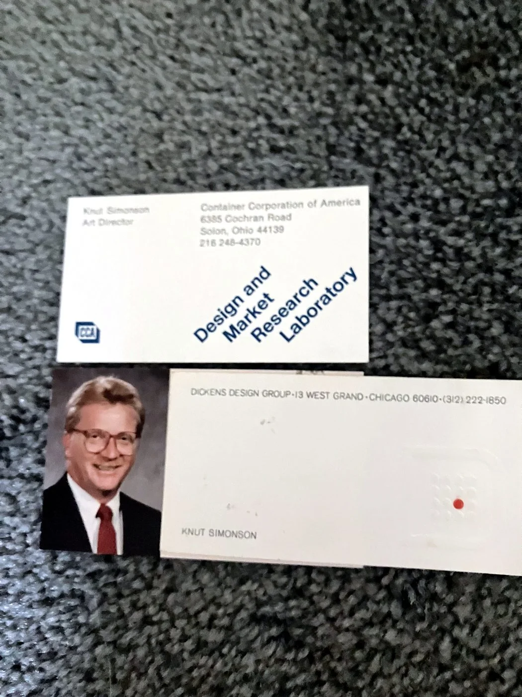
Knut Simonson graduated from art school in Milwaukee in 1967, spent about two years at Container Corporation of America, and joined Dickens Design Group around 1969, staying about a year and a half. Dickens was a small operation, fewer than twenty people working out of a Loop building with windows overlooking the rumble of Chicago traffic, but it handled big, visible clients.
His path into design wasn't exactly planned. A mediocre year of high school Spanish and a scheduling conflict landed him in an art class almost by accident. A teacher there became the first person to tell him he had a future in it. "You're pretty good, you should go to art school," Knut recalled the teacher telling him. It was a simple comment that quietly redirected his life.
Knut arrived at Dickens as a young designer with a practical streak. He wasn't chasing fame. He wasn't trying to reinvent anything. He was trying to do good work. "I was a problem solver," he said of his own approach, describing how he'd size up an assignment. "When they say, 'here, we need this design,' I would evaluate it and look at it as solving the problem, to make it sell more product." That mindset earned him opportunities to work on large, meaningful projects.
One of those still amuses him. Dickens designed a soda for General Mills meant to compete with 7 Up, called Feel Free, and the photo shoot for the can turned into a team outing. "We went out to Lake Michigan with a photographer, and we took pictures of four or five of us employees," he said, "on the beach, and we put them on the can, with the word Feel Free, and these people are all jumping up in the air." The product made it into test markets before General Mills pulled the plug, but Knut still has samples of the printed cans, including the one with himself mid-jump. "That's your claim to fame," we told him. He laughed and agreed.

Around the same time, he also redesigned the packaging for John's Pizza, a Chicago pizza brand, keeping the client's existing product photography and simply refreshing the name and layout around it. It worked well enough that the design stayed in use for years.
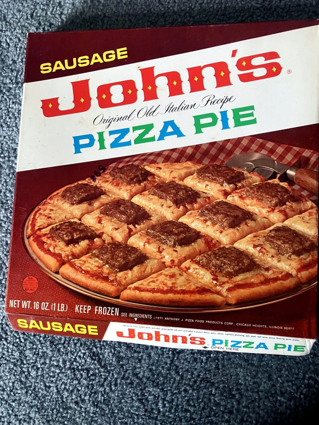
Then, sometime around 1970, midway through his run at Dickens, TaB landed on his desk.
A chemistry problem becomes a design problem
TaB's original formula relied on cyclamate as its sugar substitute. When cyclamate was banned in 1969, Coca-Cola didn't have a saccharin-only replacement ready yet. According to Mark Pendergrast's history of the company, For God, Country and Coca-Cola, the interim fix was a blend of saccharin and real sugar, used while chemists worked toward a permanent formula.1 For a stretch, TaB shipped in a can that said so plainly: "Sugar Added, No Cyclamates."
That formula didn't last. Once Coca-Cola settled on a saccharin-only formula, the can needed to say something very different, and just as urgent: that TaB was sugar-free again, and it needed to say so clearly, at a glance. It was the kind of problem that didn't call for reinvention so much as clarity.
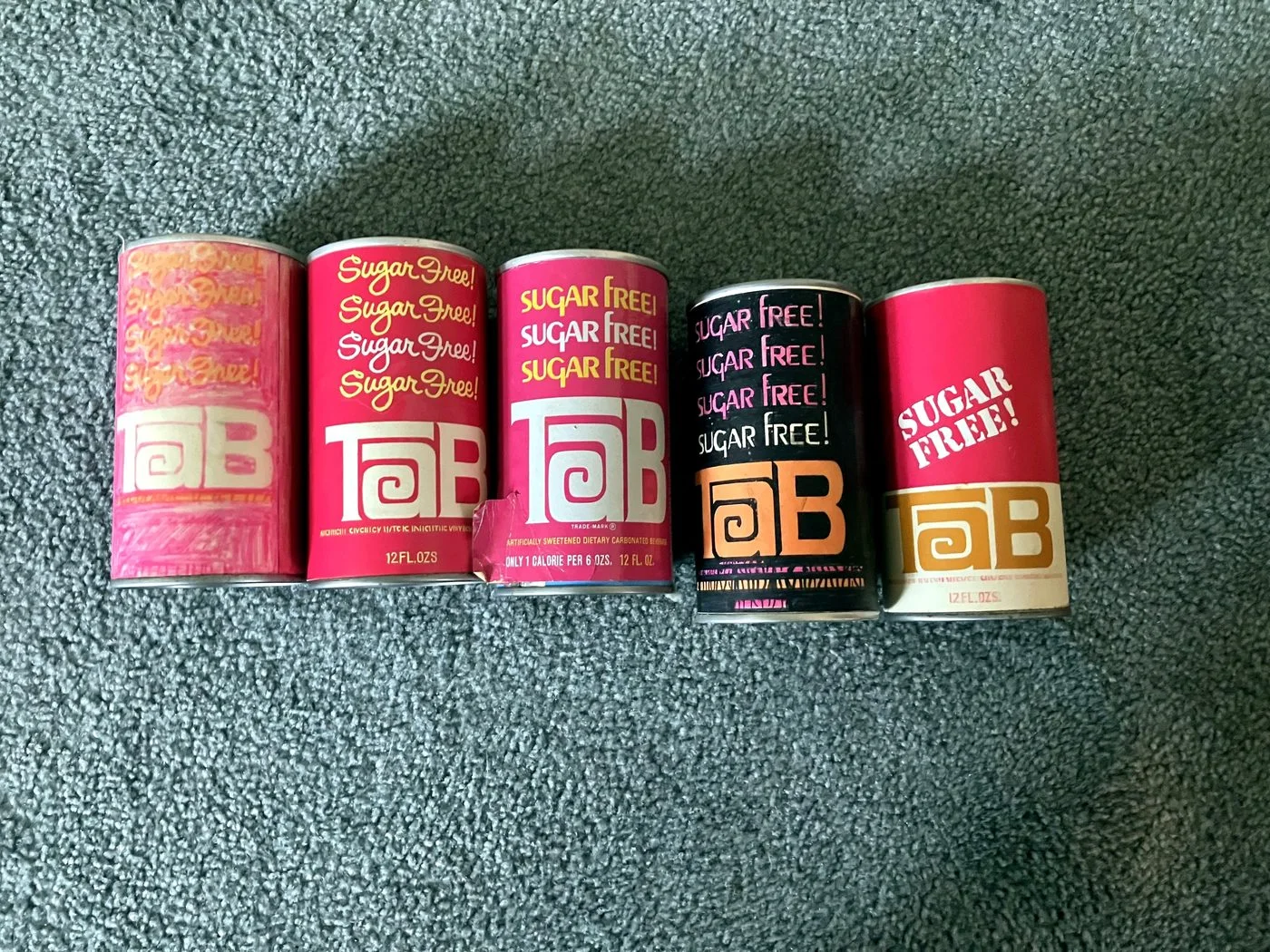
"So I came up with a pink can," Knut told us, saying it with the plainness of someone describing a solution that feels obvious only after you hear it. "I repeated the word sugar free… in a script above the word TaB. That was the original design."
His first version repeated "sugar free" four times. Production trimmed it to three. Knut still has samples of both versions, in two different type treatments, alongside the can that finally went to market. The message, in every version, was unmistakable: this can was not like the others.
Why pink? Carrying the brand forward
The pink wasn't new. It was already there.
"One of the three letters was pink… from the original design," Knut explained. "TaB was a pink and blue logo. I left off the blue, so I used the pink from the original. And that's how I came up with the pink."
He didn't reinvent TaB's identity. He distilled it, keeping the one color that mattered and letting it speak louder.
Knut had learned this principle at Container Corporation of America: consumers respond better when a redesign keeps a visible thread back to what they already know. You don't replace the identity. You refine it. Brand equity. Even as TaB changed looks over the decades that followed, that pink, Knut's pink, carried all the way through to the end. It became the brand.
In the end, the pink can didn't replace TaB's identity. It sharpened it.

Built by hand
There was no computer software. No computers at all, actually. No digital mock-ups, no shortcuts.
Knut's process was entirely analog: the kind of hand-built work that starts with a pencil sketch and ends with ink-stained fingers. Each concept was rendered in magic marker, built to look as close to a finished, printed can as the medium allowed, then carried in for the client to review. The tools were simple, markers, glue, scissors, board, but the results had to feel real enough for Coca-Cola to imagine them on a shelf.
Once a design was approved, it moved to a hand-built mock-up: cut, glued, and wrapped by hand. A physical object, not a digital file. Something you could hold, turn in your palm, and imagine sitting in a grocery aisle.
Did he have any sense that he was creating something people would still talk about fifty years later? "No, not at all," he said. "I just would do this stuff… it was very natural to me. I was very, very influenced by what I thought consumers would want to see in the store."
Did he ever see his creations in the wild?
It's less a single vivid memory than a quiet, ongoing awareness. "It was kind of neat," he said. "I was fortunate enough to work in design for a lot of different companies and actually see stuff in the stores." But he's quick to say he never fully registered the scale of it. "I didn't realize or think about it as being millions of people buying it," he said.
And yes, he drank it himself. "Oh, yeah, of course. Yeah, yeah, I did," he said, though these days he and his wife stick to a short, familiar list of drinks and don't keep diet sodas around anymore.
A design that outlived the decade
The pink can didn't just sell soda. It became scenery.
TaB's blush-pink cans turn up as background props in films and shows from the era: the kind of casual, uncredited appearances that tell you a product has become part of everyday life. A can on a desk. A can in a teenager's bedroom. A can in a vending machine in a movie that still gets watched today.
Airplane! Scrooged. WarGames. 9 to 5. The list goes on and on, and it doesn't stop at movies from the era itself. Newer shows set in the '70s and '80s reach for that same pink can, because it does work a set designer doesn't have to explain. One glance and the audience knows exactly what decade they're in. See TaB's full run on screen →
Knut notices, every time. "I have to admit, if I see that [can], I always notice it," he said. "I was fascinated by that. But nobody knows who I am or who did it, so it doesn't make me different." He paused, then added, "But I don't mind. It is kind of a neat thing to see happen. It became a nice compliment, I guess you'd say."
Knut's career didn't stop with TaB
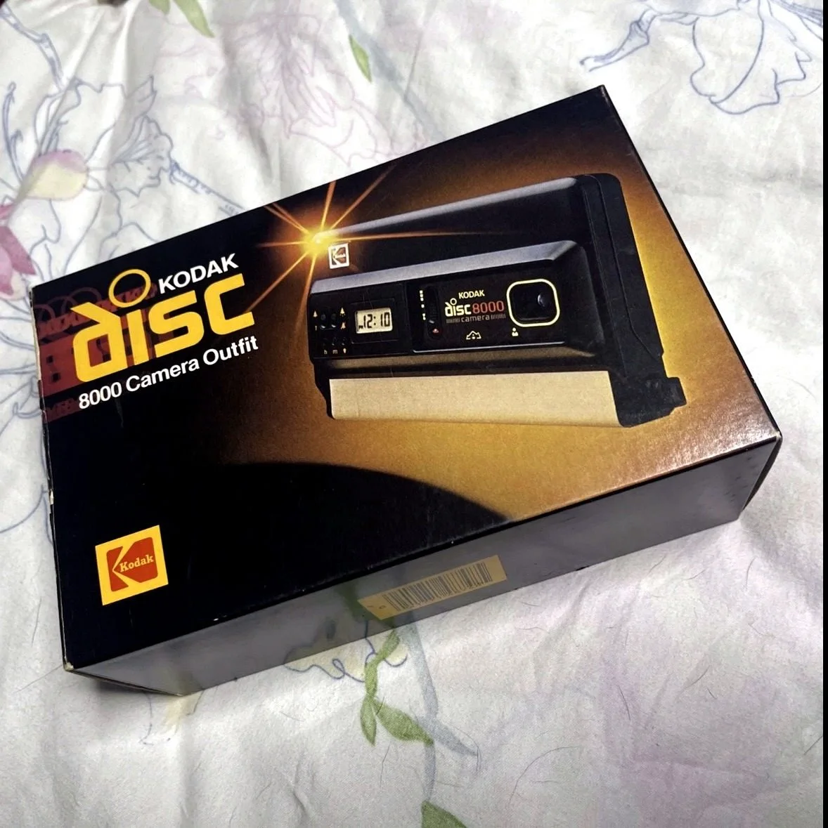
After Dickens Design Group, Knut spent fourteen years at Eastman Kodak, designing packaging for one of the largest companies in the country, including the Kodak Disc Camera.
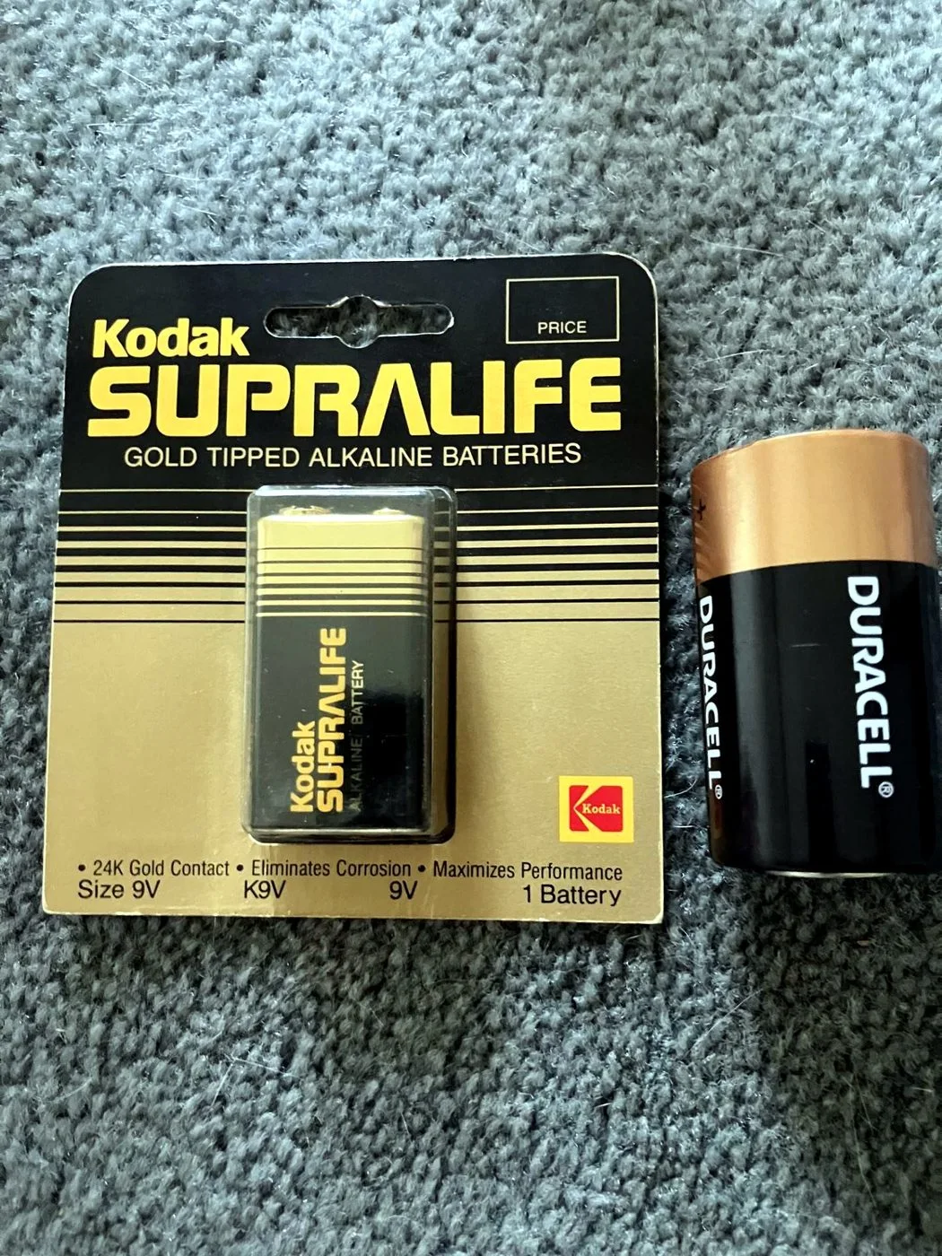
He also redesigned Kodak's battery packaging, over the objections of the outside ad agency that pitched the original concepts, a fight he won by walking his marketing team through the reasons the agency's designs would fail on the shelf.
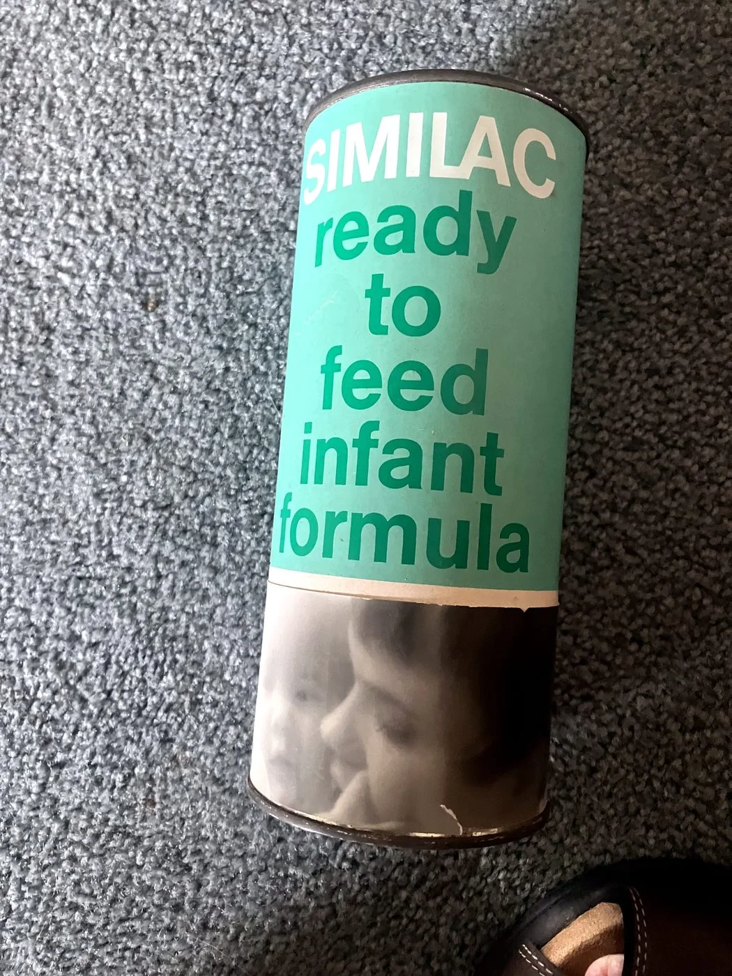
After Kodak, he didn't slow down. He spent another fifteen years doing packaging design and sales work across roughly ten different companies, walking into interviews with a portfolio of his own printed work, real cans, real boxes, real labels, and usually walking out with a job offer. The client list from that stretch reads like a tour of the grocery store: Heinz Ketchup, Similac infant formula, and General Mills' Mini-Mix cake mix line among them, everyday products that people used without ever knowing his name was behind them.

He didn't chase notoriety. He chased good work, and kept doing it, quietly and consistently, for something like forty years before he finally retired.
Looking back
What stands out most about Knut is his humility.
He talks about packaging design the way an engineer talks about a bridge: did it solve the problem, did it hold up, did it do what it needed to do? There's no ego in it, no mythology to it, just honest work, done carefully and with intention.
We asked him one last question: if he closed his eyes and thought about the impact of his work all these years later, how would he describe it? He didn't reach for the pink can. He reached for something bigger.
"I was very proud of it," he said. "I was just proud of what I had accomplished, coming from a small town in Wisconsin, with very little education compared to most people, four years of art school. I've accomplished a lot."
Even asked directly about his legacy, Knut measured it in the same plain, practical terms he uses for everything else: not fame, not credit, just a job done well and a life built carefully on top of it.